CSS Flexbox in Form - Part 1
2018-09-09 00:00:00 +0000The objective of the project is to use flexbox to have an image appears side by side with the form. The image and form will become responsive and force image to appear on top of the form at a certain width.
Before we dive in, let’s go over flex and what it does. Flex is a CSS property that allows items to shrink or grow to fit the content inside a container. In this case, we want to shrink the image and grow the form to fit the content upon decreasing our windows screen.
The first step is to write HTML skeleton for the form. Here’s my html code:
<form id="survey-form">
	<h1 id="title">Survey Form</h1>
	<p id="description">Let us know how we can improve Fictional Co.</p>
	<label id="name-label" for="name">* Name: </label>
	<input id="name" type="text" name="name" placeholder="Enter your name" required>

	<label id="email-label" for="email">* Email: </label>
	<input id="email" type="email" name="email" placeholder="Enter your Email" required>

	<legend>Which option best describes your current role?</legend>
	<select id="dropdown">
		<option selected disabled>Select an option</option>
		<option value="student">Student</option>
		<option value="job">Full-Time Job</option>
		<option value="other">Other</option>
	</select>

	<legend>* How likely is that you would recommend Fictional Co. to a friend?</legend>
	<div id="radio">
		<div>
			<input type="radio" id="recommend1" name="recommend" value="definitely" required>
			<label for="recommend1"> Definitely</label>
		</div>
		<div>
			<input type="radio" id="recommend2" name="recommend" value="maybe" required>
			<label for="recommend2"> Maybe</label>
		</div>
		<div>
			<input type="radio" id="recommend3" name="recommend" value="not-sure" required>
			<label for="recommend3"> Not Sure</label>
		</div>
	</div>

	<legend>Things that should be improved in the future (Check all that apply):</legend>
	<div id="checkbox">
		<div>
			<input type="checkbox" id="front-end" name="improvement" value="front-end">
			<label for="front-end">Front-End Projects</label>
		</div>
		<div>
			<input type="checkbox" id="back-end" name="improvement" value="back-end">
			<label for="back-end">Back-End Projects</label>
		</div>
		<div>
			<input type="checkbox" id="data-visual" name="improvement" value="data-visual">
			<label for="data-visual">Data Visualization</label>
		</div>
	</div>

	<legend>Any comments or suggestions?</legend>
	<textarea placeholder="Enter your comment or suggestions here"></textarea>
	<input id="submit" type="submit" value="Submit">
</form>
To have the image appears side by side with the form, both image and the form needs to be child from the same parent, as such:
<div class="container">
	<div id="img"></div>
	<form id="survey-form">
		/* your form html */
	</form>
</div>
In an external CSS file, set your class container as display flex. Save your file and refresh your browser to see the changes on your screen.
An image is expected to fill up on the left hand side, where is the image then?
The image does not show up as expected because #img is a container and not a content item. By default, the container’s height is 0px. Image will not appear, unless we explicitly defined a width of a container. Add some margin to #survey-form container to give it some space.
#container{
	display: flex;
}
#survey-form{
	margin: 4%;
}
#img{
	width: 40em;
	background-image: url("https://source.unsplash.com/1_CMoFsPfso/3000x2000");
}
Let’s add some responsiveness to our image that allows it to grow and occupy the top. To do that, we will add a media query, which is another CSS property that modifies our site according to the device’s type or screen width. In our case, we only care how form looks upon decreasing our screen’s size:
@media only screen and (max-width: 600px){
	/*add css property */
}
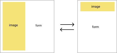
To have the image and form in the same column, we need to set the parent element with property flex-wrap as wrap. This forces the form to appear in the next line. Note, flex items can appear in a single line depending on the width of each flex item. The image and form wrap in a separate line because we set #img container to take as much width it possibly can.
@media only screen and (max-width: 600px){
	#container{
		flex-wrap: wrap;
	}
	#survey-form{
		flex-shrink: 1;
	}
	#img{
		flex-shrink: 3;
		height: 4.4em;
	}
}
Lastly, we will use flex-shrink to shrink and expand our items to fill the container. The form will set to a flex-shrink of 1, and image to a flex-shrink of 3. The larger the value of flex-shrink, the larger the image will expand in comparison to a value set for form.
Again, don’t forget to adjust the #img container’s height for the image to appear.
That is all to the project in terms of flexbox! The rest of the project is about styling your layout and appearances.
In the second part to survey form, we will explore how to use CSS grid to layout the content inside the form.
Cheers,
Anh